Needs Assessment & Usability Evaluation
I worked in a team with the City of Detroit's Office of Innovation and Emerging Technologies (IET) to conduct needs assessments and usability evaluations on the Detroit Department of Transportation (DDOT) website - DDOT.info.
DDOT.info is a mobile-focused interactive web tool for checking city bus schedules. The client needed assistance in creating a better mobile experience and making the site more intuitive, accessible, and inclusive for Detroit's public transit users.
Role: UX Researcher & Designer | Team Size: 4 | Duration: 13 Weeks
Tools: Qualtrics (for the survey), InDesign (for lo-mid-fi wireframes),
iMovie (for video editing)
Skills: UX Field Research, Surveys, User Personas and Scenarios, Qualitative Coding, Heuristic Evaluations, Needs Assessment,
Usability Testing, Interviews
RESEARCH QUESTIONS
From the information gleaned from our client contact, we established these three research questions.
-
How are riders using DDOT now, and what role does technology play?
-
How are riders currently using the bus system?
-
How are riders getting information regarding routes, stops, rides, closures, delays, and other pertinent bus-riding information?
INTERVIEWS
We spent a day in Detroit to better understand users' bus experiences and have the opportunity to observe these interactions directly.
Interviewed 1 stakeholder Interviewed 8 Participants
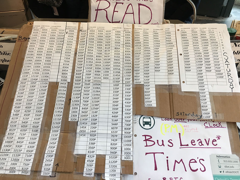
Observed only analog tools being used by riders and staff at the Rosa Parks Transit Center
Followed an intra categorical approach. In-person interviews were limited to 10-15 minutes Phone interviews lasted between 20-30 minutes
Noted common themes and patterns from our interviewees
Information about bus closures and delays are not provided. Most of our interviewees did not use technology tools and applications to find
pertinent bus information
Despite our observations, analytics from the IET, show that 1500 people are using the tool every day, a number they say is steadily increasing since the release of DDOT.info
Analog Tools used in the Rosa Parks Transit Center:


PERSONAS
"Simplicity is key"


"Technology should make life easy"
"Don't fix what isn't broken"

Brandon Lewis
Student
Goals
-
To have a tool with cohesive information, so he doesn't have to use multiple tools to navigate the city
Needs
-
App tools data matches the PDF schedules
-
A tool with both the city and suburban bus route information
Frustration
-
Lack of relevant information
-
Inaccurate data
James Burnham
Software Developer
Goals
-
To have a tool with real-time feedback; downloadable content, and cross connectivity
Needs
-
A tool that includes PDF schedules
-
Public transportation be less tedious
Frustration
-
Limited options
-
Inaccurate data
-
Inefficient tools
Shelia Tompkins
Grocery Store Manager
Goals
-
Prefers to use conventional way-finding such as word of mouth
Needs
-
Leaves space in her schedule for hiccups when planning trips
-
New technology is intimidating to her, so she prefers her "wait and see" technique
Frustration
-
Inaccurate data on various tools
-
Smartphone-based tool
SURVEY
To get a more detailed analysis of the general practices of bus riders, we distributed a survey to Detroit bus riders learning about their experience taking the bus. The survey questions allowed users to share their experiences with riding the bus, including how long they've been bus riders, how they find information about buses, and what technology tools they use in the process.
25 Respondents
Analyzed results with Microsoft Excel
Pinpointed patterns in responses and to previous project deliverables
Findings
-
No official information about bus closures and delays.
-
Users that do not utilize technology to plan their bus trips have some level of difficulty in finding a route and stop information.
-
Longtime bus riders found it easier to find bus information than newer riders.
Recommendations
-
DDOT.info includes information about delays and closures for riders that use the service.
-
Integration with the SMART bus transit system would be useful for riders that travel outside of the city.
-
Include critical features of the Transit app and Google Maps into DDOT.info to better serve the
population of bus riders that employ different aspects of each tool.

HEURISTIC EVALUATIONS
Our team analyzed DDOT.info using the heuristic evaluation method. The method of heuristic evaluations involves assessing ten usability heuristics created by Nielsen (Nielsen, 1994). These ten usability heuristics were used to evaluate the quality of the DDOT.info system.
Goal: generate a well-rounded, unbiased set of observations before looking for overlapping results among the evaluations
Ten Heuristics:
-
Visibility of System Status
-
Match between system & real world
-
User Control & Freedom
-
Consistency & Standards
-
Help users diagnose errors
-
Error Prevention
-
Recognition rather than Recall
-
Efficiency of Use
-
Aesthetics
-
Help & Documentation
Severity Rankings:
0. Don’t agree that this is a usability problem OR This is a usability strength
1. Cosmetic problem, low priority
2. Minor usability problem, fix as time allows
3. Major usability problem, important to fix
4. Usability catastrophe, imperative to fix
Findings
-
Some areas of the interface that feel onerous to read (Heuristic 9, Severity 3).
-
A disconnect and a lack of consistency between language that real-world users use (Heuristic 4, Severity 3).
-
The user can’t make a mistake and easily correct it.
-
The system does not support undo and redo (Heuristic 3, Severity 3).

Reflections
Many potential shortcomings exist when performing a heuristic evaluation using Nielsen’s heuristics. The heuristic analysis was performed by four individuals who are already relatively familiar with DDOT.info, and might not interact with it the same way a new user might try to. Furthermore, our technical skills are relatively advanced, so our idea of what is or is not an issue may differ from users with less technological expertise.
ANALYTICS DASHBOARD
We chose our metrics based on what would be the most helpful for DDOT.info to know. In other words, the analytics that could give the most insight for DDOT.info to evaluate its product and how it can be improved.

USABILITY TESTING
Usability Test The test consisted of three tasks that each user was asked to complete while the present members of our team took notes on the users’ behaviors. Our goal was to discover what usability issues were present in the DDOT.info system, as well as analyze how easily users find departure times.

5 Users

Pre and post questionnaires. Designed three tasks to answer our research questions which tested two of the major features of DDOT.info. In-depth Interview after completing tasks. Participants recruited through convenient sampling and bus riders in Ann Arbor. We conducted a pilot test with 3 users.

Held a debriefing session to analyze the data after tests and pinpointed common themes and issues.
Findings
-
Key areas on the interface that were onerous to read and navigate.
-
Users utilized the map to assist them in finding pertinent bus information, but the map provided did not support users in their journey and made users feel confused.
-
Three out of our five users expressed confusion in regard to the navigation bar.
Recommendations
-
Eliminate text that may not be relevant to users.
-
Create a map that is larger in size and more detailed.
-
Enable users to go back to the homepage of DDOT.info when they click on the top left logo.
-
Ensure that the navigation bar categories appear when user first arrives
at the selected bus route page.
-
Differentiate the navigation bar categories “Overview”, ‘Bus Stops”, and “Schedule”. Perhaps, separate this category from the main DDOT header. The hierarchy of material may be very useful in
this regard as well.
FINAL VIDEO